

Machine learning is an application of AI(Artificial Intelligence) that makes computers to learn themselves from given data without being explicitly programmed. Now days computers are much powerful that they can easily be trained with much amount of data with so much minimum time. As a data scientist it is also mandatory that one have to know how the data is varying, how the data is categorized and how distributed. With the help of Exploratory Data Analysis(EDA) we get conclusions about the data that human can observe with the help of graphs, charts and values.
Definition
Exploratory Data Analysis refers to the critical process of performing initial investigations on data so as to discover patterns,to spot anomalies,to test hypothesis and to check assumptions with the help of summary statistics and graphical representations.
Explanation of EDA with sample iris dataset:
I am taking iris dataset as a sample dataset and performing EDA. Iris dataset contains four features:
-
- sepal_length
- sepal_width
- petal_length
- petal_width and 3 classes
- setosa
- verginica
- versicolor
Please click here to get more information about iris dataset.
First step is to import required libraries and than read data files.
import pandas as pd
import seaborn as sns
import matplotlib.pyplot as plt
import numpy as np
iris = pd.read_csv(“iris.csv”)
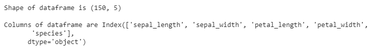
Now we have to show number of raws and columns in dataframe, shape provides that functionality. After that we have to figure out which columns that dataframes contains. dataframe.columns returns list of columns that dataframe contains.
print(“Shape of dataframe is”, iris.shape)
print(“Columns of dataframe are” , iris.columns)
We have to observe how the data is, so we have to display initial first raws.head() function provides that functionality.
iris.head()

Data contains null values , so we have to fill that null blocks with some values. So first of all we have to figure out how much null each columns contains.
iris.isna().sum()

Here species is target column , means we have to classified data in spices. So we have to observe which unique species exists in data frame.
iris[“species”].value_counts()

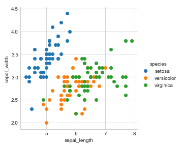
2 D Scatter plot
Two-dimensional scatterplots visualize a relation (correlation) between two variables X and Y . Individual data points are represented in two-dimensional space, where axes represent the variables . The two coordinates that determine the location of each point correspond to its specific values on the two variables.
sns.set_style(“whitegrid”);
sns.FacetGrid(iris, hue=”species”, size=4) \
.map(plt.scatter, “sepal_length”, “sepal_width”) \
.add_legend();
plt.show();
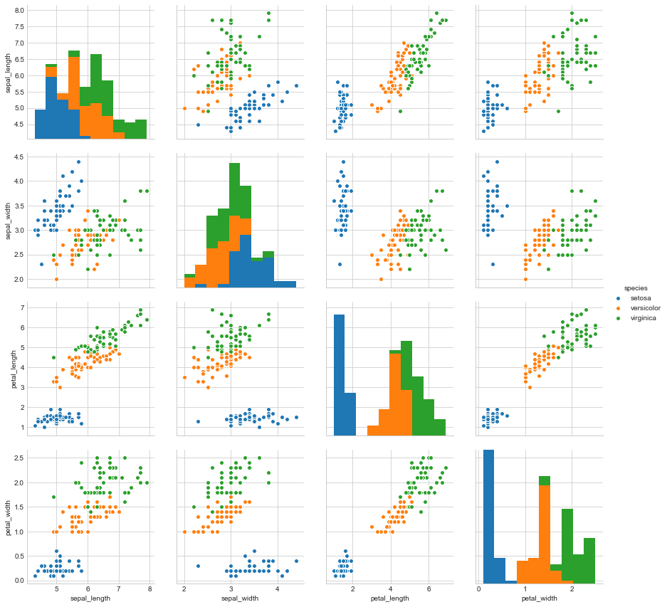
sns.set_style(“whitegrid”);
sns.pairplot(iris, hue=”species”, size=3);


plt.show()
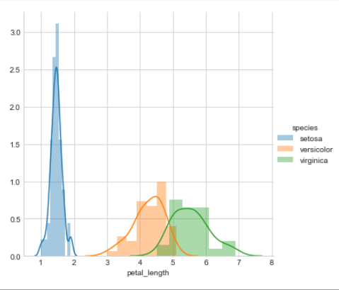
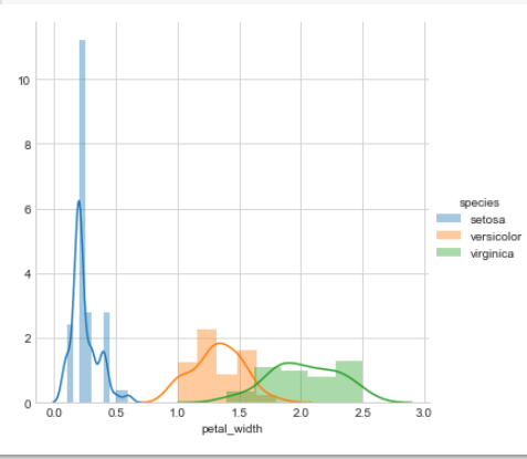
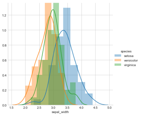
A histogram is an accurate representation of the distribution of numerical data. It is an estimate of the probability distribution of a continuous variable. It differs from a bar graph, in the sense that a bar graph relates two variables, but a histogram relates only one.
sns.FacetGrid(iris, hue=”species”, size=5) \
.map(sns.distplot, “petal_length”) \
.add_legend();
plt.show();
sns.FacetGrid(iris, hue=”species”, size=5) \
.map(sns.distplot, “petal_width”) \
.add_legend();
plt.show();
sns.FacetGrid(iris, hue=”species”, size=5) \
.map(sns.distplot, “sepal_length”) \
.add_legend();
plt.show();

sns.FacetGrid(iris, hue=”species”, size=5) \
.map(sns.distplot, “sepal_width”) \
.add_legend();
plt.show();
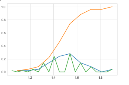
PDF and CDF
- PDF ( Probability Density Function): This basically is a probability law for a continuous random variable say X ( for discrete, it is probability mass function).
The probability law defines the chances of the random variable taking a particular value say x, i.e. P (X=x).
However this definition is not valid for continuous random variables because the probability at a given point is zero.
An alternate to this is: pdf= P (x-e<X<=x)/e as e tends to zero.
- CDF ( Cumulative Distribution Function): As the name cumulative suggests, this is simply the probability upto a particular value of the random variable, say x. Generally denoted by F, F= P (X<=x) for any value of x in the X space. It is defined for both discrete and continuous random variables.
iris_setosa = iris.loc[iris[“species”] == “setosa”];
counts, bin_edges = np.histogram(iris_setosa[‘petal_length’], bins=10,
density = True)
pdf = counts/(sum(counts))
cdf = np.cumsum(pdf)
plt.plot(bin_edges[1:],pdf);
plt.plot(bin_edges[1:], cdf)

counts, bin_edges = np.histogram(iris_setosa[‘petal_length’], bins=20,
density = True)
pdf = counts/(sum(counts))
plt.plot(bin_edges[1:],pdf);

plt.show();
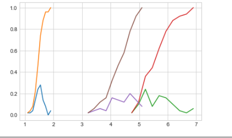
We can plot distribution of different different classes on single plot . With the help of this plot we can compare and visualize distribution of an attribute for different different classes .
Here we have observed that petal_length is best attribute to differentiate classes . So below is the plot of petal_length for each classes.
iris_setosa = iris.loc[iris[“species”] == “setosa”];
iris_virginica = iris.loc[iris[“species”] == “virginica”];
iris_versicolor = iris.loc[iris[“species”] == “versicolor”];

counts, bin_edges = np.histogram(iris_setosa[‘petal_length’], bins=10,
density = True)
pdf = counts/(sum(counts))
cdf = np.cumsum(pdf)
plt.plot(bin_edges[1:],pdf)
plt.plot(bin_edges[1:], cdf)

# virginica
counts, bin_edges = np.histogram(iris_virginica[‘petal_length’], bins=10,
density = True)
pdf = counts/(sum(counts))
cdf = np.cumsum(pdf)
plt.plot(bin_edges[1:],pdf)
plt.plot(bin_edges[1:], cdf)

#versicolor
counts, bin_edges = np.histogram(iris_versicolor[‘petal_length’], bins=10,
density = True)
pdf = counts/(sum(counts))
cdf = np.cumsum(pdf)
plt.plot(bin_edges[1:],pdf)
plt.plot(bin_edges[1:], cdf)

plt.show();
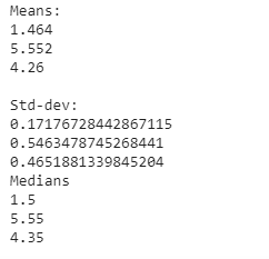
Mean, Variance and Std-dev
Now let’s observe core characteristics of data like mean , median , variance and standard deviation for each classes.
print(np.mean(iris_setosa[“petal_length”]))
print(np.mean(iris_virginica[“petal_length”]))
print(np.mean(iris_versicolor[“petal_length”]))

print(“\nStd-dev:”);
print(np.std(iris_setosa[“petal_length”]))
print(np.std(iris_virginica[“petal_length”]))
print(np.std(iris_versicolor[“petal_length”]))

print(“\nMedians:”)
print(np.median(iris_setosa[“petal_length”]))
print(np.median(iris_virginica[“petal_length”]))
print(np.median(iris_versicolor[“petal_length”]))
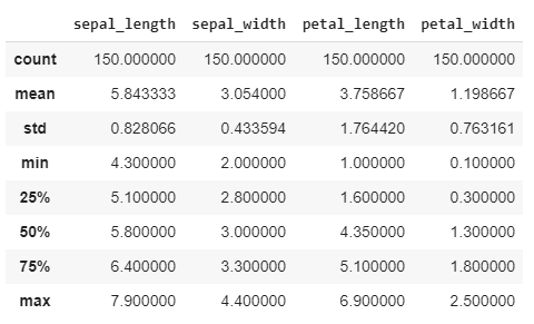
With the help of describe method we can observe mean, median, minimum, maximum and spread of each feature.
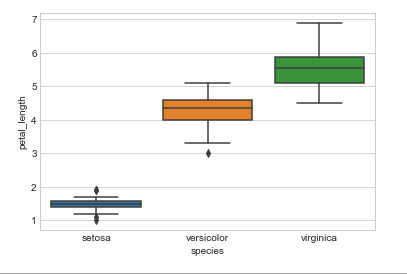
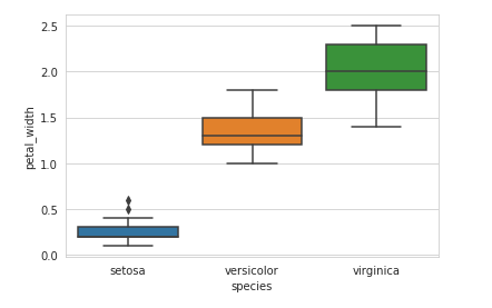
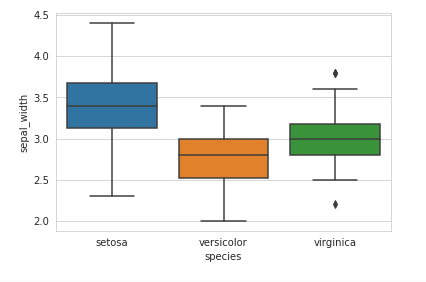
Box plot
A boxplot is a standardized way of displaying the distribution of data based on a five number summary (“minimum”, first quartile (Q1), median, third quartile (Q3), and “maximum”). It can tell you about your outliers and what their values are. It can also tell you if your data is symmetrical, how tightly your data is grouped, and if and how your data is skewed.
sns.boxplot(x=’species’,y=’petal_length’, data=iris)
sns.boxplot(x=’species’,y=’petal_width’, data=iris)
sns.boxplot(x=’species’,y=’sepal_width’, data=iris)
sns.boxplot(x=’species’,y=’sepal_length’, data=iris)
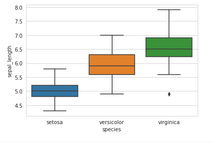
Conclusion : Here we can conclude that with the help of ‘petal_length’ attribute we can differentiate classes properly.
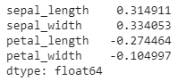
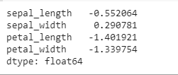
Correlation ratio
In statistics, the correlation ratio is a measure of the relationship between the statistical dispersion within individual categories and the dispersion across the whole population or sample. Correlation heatmap shows correlation ratio between each columns.
plt.figure(figsize=(5,5))
sns.heatmap(iris.corr(),
vmin=-1,
cmap=’coolwarm’,
annot=True);

Skewness and Kurtosis
Skewness is a measure of symmetry, or more precisely, the lack of symmetry. A distribution, or data set, is symmetric if it looks the same to the left and right of the center point.
Kurtosis is a measure of whether the data are heavy-tailed or light-tailed relative to a normal distribution. That is, data sets with high kurtosis tend to have heavy tails, or outliers. Data sets with low kurtosis tend to have light tails, or lack of outliers. A uniform distribution would be the extreme case.
iris.skew(axis = 0, skipna = True)
If the skewness is between -1 and -0.5(negatively skewed) or between 0.5 and 1(positively skewed), the data are moderately skewed.
Now, If the skewness is less than -1(negatively skewed) or greater than 1(positively skewed), the data are highly skewed.
from scipy.stats import kurtosis
iris.kurtosis(axis=0)
So finally we can conclude that EDA helps in best way to observe data to humans with the help of graphs and characteristics of numerical data.
Hey there, my name is Parth Shah. I am from Modasa(Gujarat).
Currently I am working in Tata Consultency Services Gandhinagar as a Assistant System Engineer Trainee.
I have completed my graduation from Dharmsinh Desai Institute of Techology, Nadiad(DDIT) in Computer Science.
As a curious student I have developed interest in Data science and Machine learning so I am learning these stuffs also.
I love to code, to play with numbers and to play with data structures and algorithms for solving problems.
I am addicted to read blogs and books related to finance and technology.
Motto of my life is to be happy and make others happy as much as I can.